Architecture & Urbanism








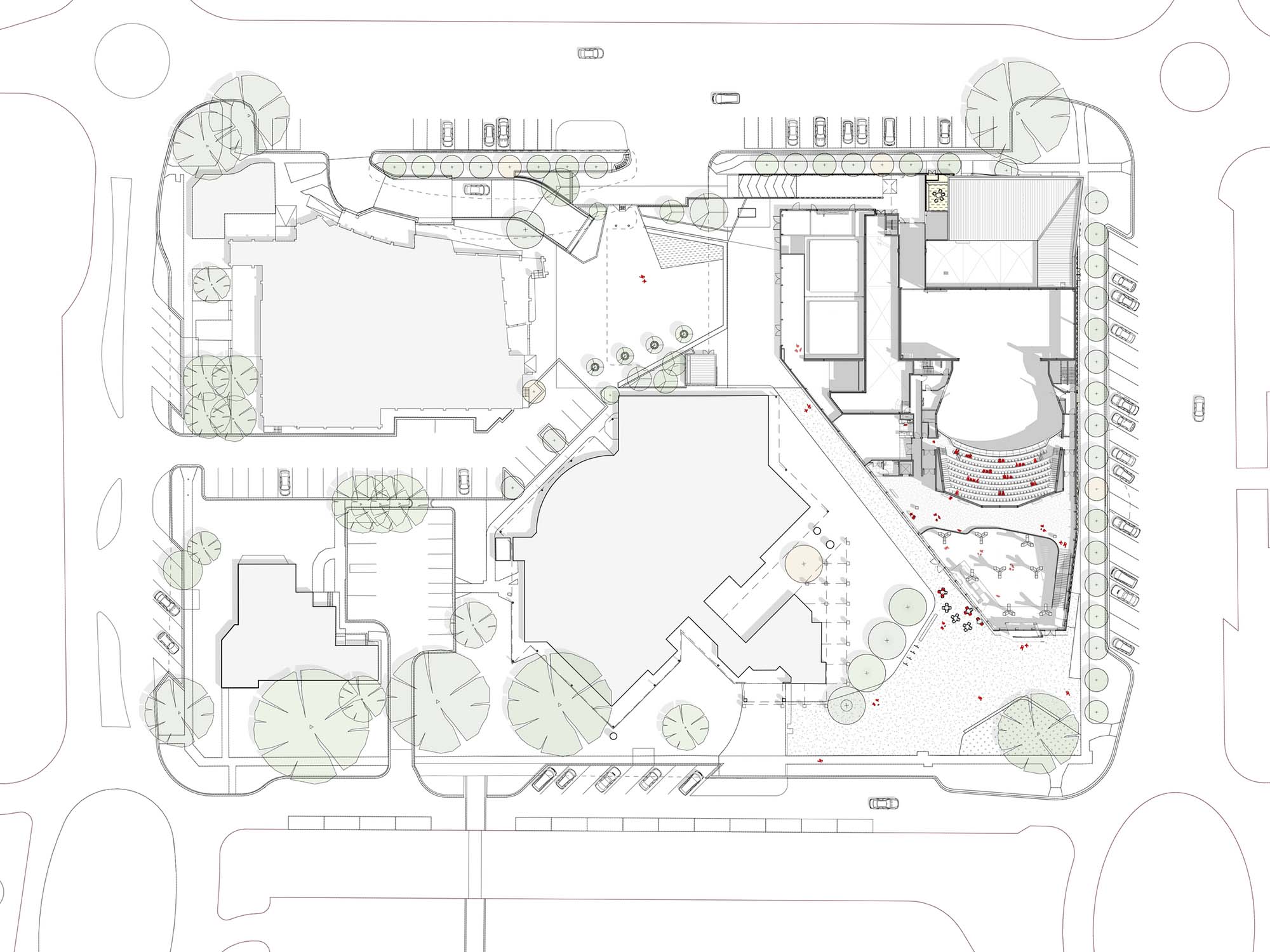

The Gippsland Performing Arts Centre is the centrepiece of the Latrobe Creative Precinct in the Victorian city of Traralgon and the country of the Gurnai / Kurnai. Katsieris Origami are Design Directors for the project having won the architectural competition together with our project partners, Jackson Architecture.
The performing arts are a celebrated aspect of life in regional Australian cities; the ‘country hall / country theatre’ occupies a special place in a town’s mythology. Our design sought to tap into the deep affinity for the performing arts in regional Australian life by combining a contemporary performance facility with more abstract ideas linked to specific place and memory.
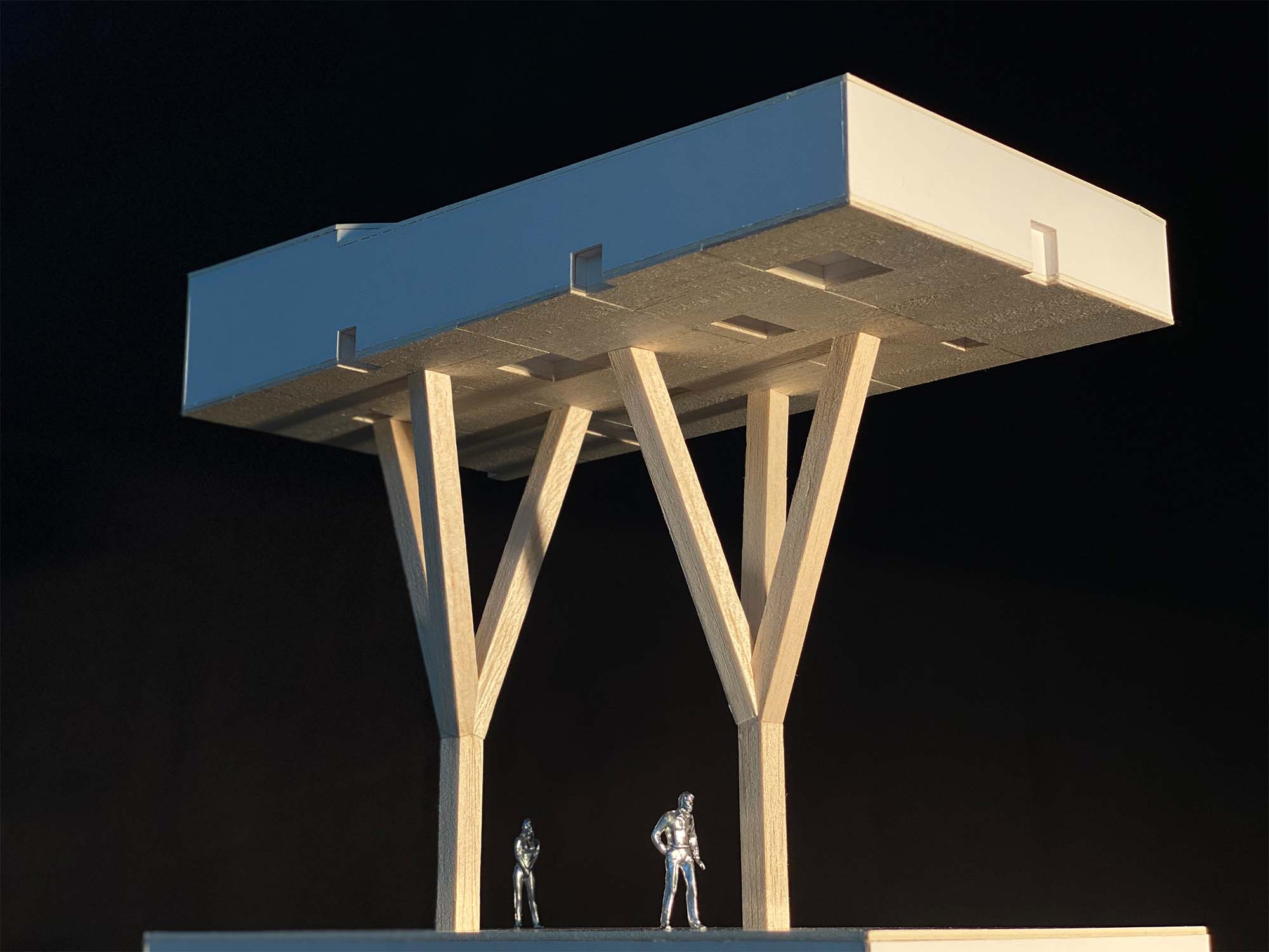
A box of trees
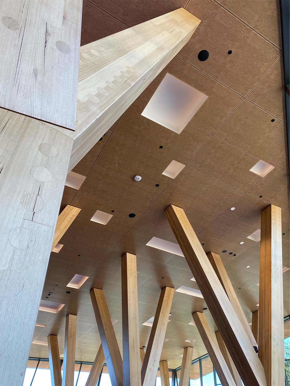
In recognition of the region’s former history of timber manufacturing and large-scale timber structures, the design uses local timber to herald a new era of mass timber construction. The main foyer is the key expression of this idea where a set of tree-like, mass-timber columns work in concert to lift and support the foyer roof.
The mass-timber columns, each 8.5 metres high, 3.2 tonnes in weight and manufactured using local Victorian Ash, are symbolic forms as much as they are primary structural supports. The set of trees allude to a lost history; a time in the late 19th and early 20th centuries when heroic timber structures, all constructed of local hardwoods, dotted the surrounding landscapes. Giant timber trestle bridges, tall viaducts and steep-incline winch-tramways were built from the strong and durable timbers endemic to the area. With the decline of the gold-mining, steam-driven railways and other industries, these impressive structures gradually dissapeared through bushfire, neglect or dismantling. They became the forgotten artefacts of a bygone era.
A box of red
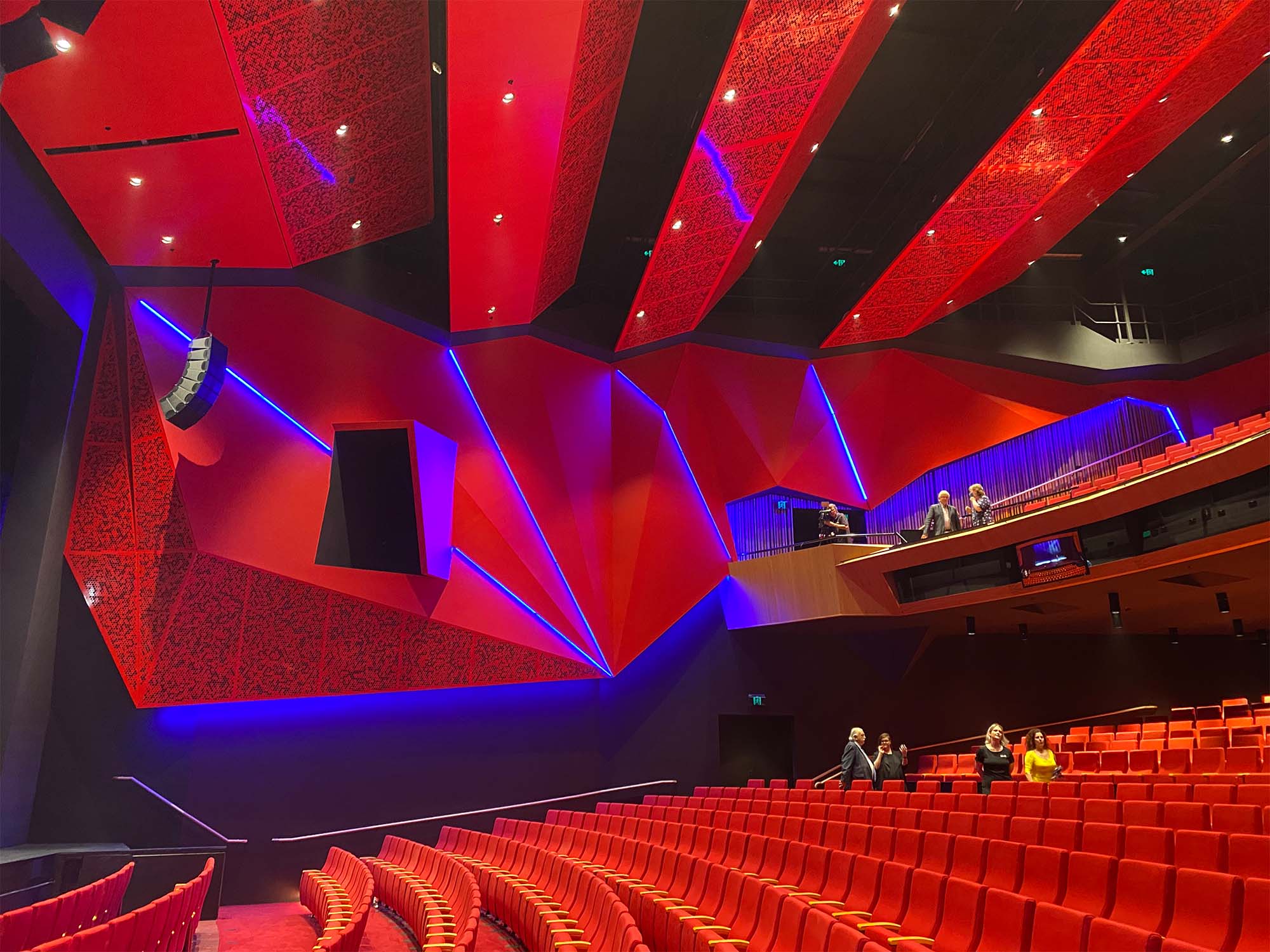
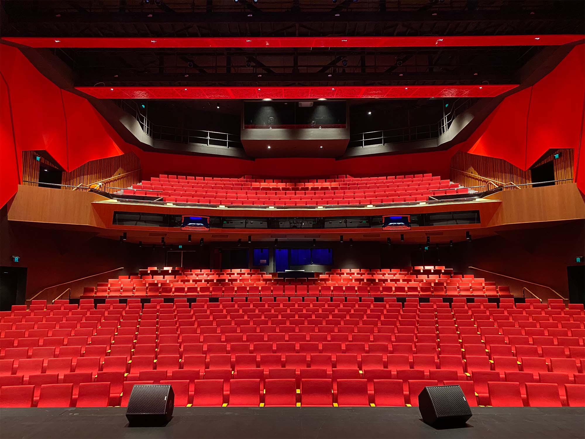
In contrast to the field of abstract trees in the foyer, the auditorium space is its philosophical other; a direct material and spatial counterpoint. Where the foyer is defined by a cluster of trees with overlapping branches splintering space, the auditorium is a singular, clear-span volume. Its scale and rich, earth-red finishes heighten audience expectations and create a chromatically-charged, immersive effect.
A surrounding braid of folded wall panels sharpen the acoustic fidelity of the auditorium by promoting the dispersal of incident sound waves.
Transformation and public realm
Our design also transformed buildings within the site to create a new external public realm: the Latrobe Creative Precinct. Like acupuncture on an urban scale, specific parts of these buildings were modified to allow them to contribute to experience. The changes link to form a new public realm formed of loose, multi-use external spaces. They include a cave-like informal performance space created from a modified section of the existing Library, and a large-scale digital screen created from a re-composed side of the former performing arts centre. Performance, festivals, markets, exhibitions, community events, moonlight cinema and passive recreation all occur in this fluid new public zone created between new, existing and ‘transformed-existing’.
Architecture can achieve so much more than the fact of its own presence. We hope that in some way, the design of this project captures the love for the performing arts our regions hold dear. We also hope it heralds an emerging, sustainable, mass timber fabrication expertise in Victoria’s Latrobe Valley and Gippsland regions.
Traditional and Continuing Land
Country of the Gunai / Kurnai people
Client
Latrobe City Council
Area
4,850 m2 (excluding parking basement)
Levels
4
Status
Complete
Project Team
Jackson Architecture & Katsieris Origami:
Architects in Association
Genre
Meta-Modern
Theme
Grove of Trees within Prismatic Volumes





The
alluring romance of the moody eastern Victorian coastline drew our client to
purchase this site over twenty years ago.
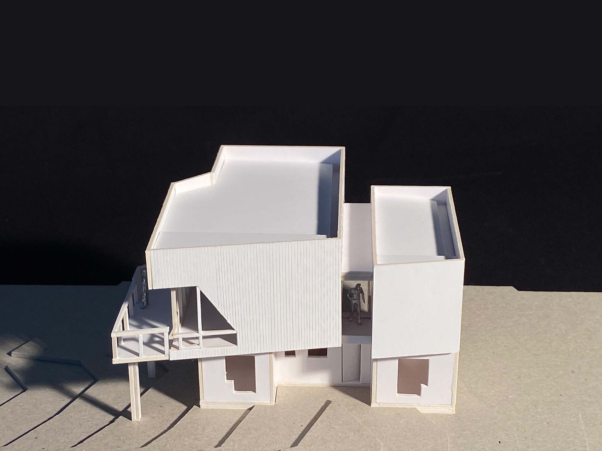
Situated on a long sand dune and fronting a thick blanket of ti-trees and coastal scrub, the design of this coastal house arose from environmental and topographic opportunities. A modest budget, the integration of mid-century fixtures and art works the client had patiently gathered over the years, and an affinity for a Brutalist aesthetic were further elements to our brief.
From our first visit and field-notes, we experienced the coastal winds and the sense of primal, elemental remove of this location. We saw these factors as opportunities for direct, robust massing with allusions to the rugged coastal cabins that originally dotted this remote part of the Victorian coast.
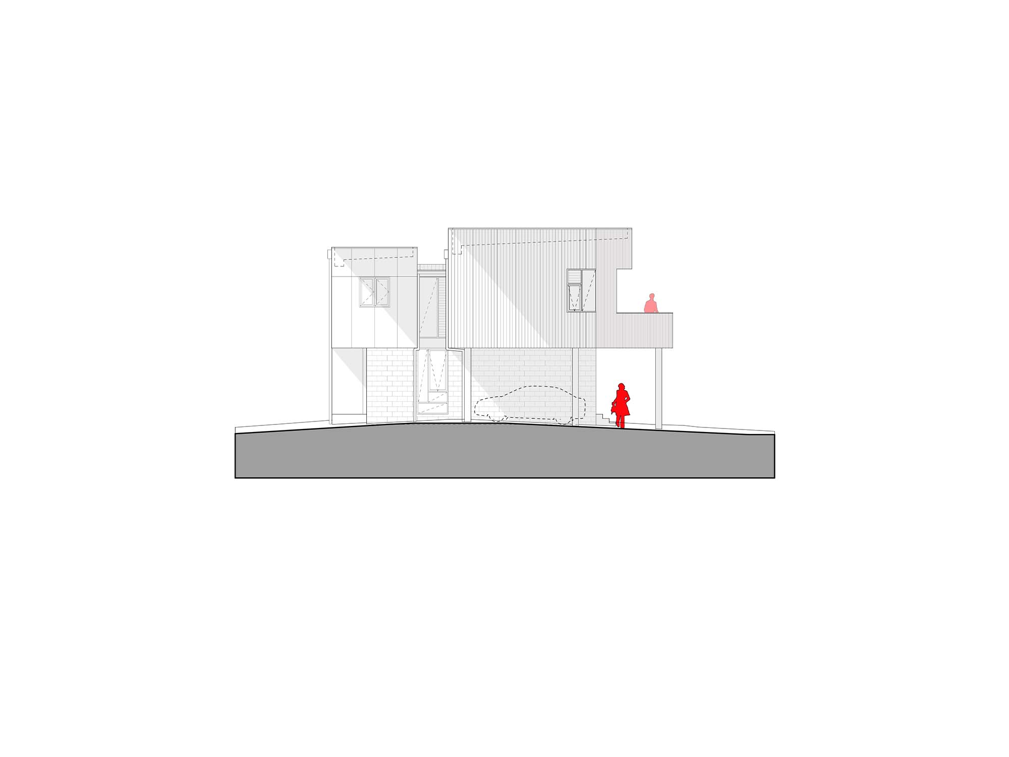
The resultant design is a 2-level house with a smaller footprint at ground level than the main upper level.
The form was designed to capture surrounding coastal scrub views and shaped to better draw cooling summer breezes into the interior. The upper level volume is bi-sected by a thin stair void that acts as a chamber to a thermal pinwheel. In summer periods, cool air emenating from the polished concrete floor slab at ground level is drawn up and through the upper level by a thermal pinwheel effect. Casement window panels and louvres are strategically oriented to induce the thermal pinwheel effect by capturing even light breezes and maximise cross-ventilation draw through the house.
The site is within a Bushfire Attack Level (BAL) rated area of 29. External façade materials, roofing systems and details were developed to accord to BAL-29 requirements.
As a cost-saving measure, the structure of the house minimises the use of structural steel. The resultant braced plywood, box-beam system allowed the maximum possible, structurally-strong building enclosure at the lowest possible construction cost.
Finishes throughout are simple and durable, in keeping with the client’s requirements for honest, ‘no-bull’, direct materiality and the equally robust, ‘no-bull’ nature of the location.
Traditional and Continuing LandCountry of the Bidewell, Yuin Gunnaikurnai & Moneo (Ngarig) people
Client
Private
Area
145.0 m2
Levels
2
Status
Complete (Images taken during construction)
Genre
Meta-Modern
Themes
Enviromentally driven volumetric interplay / Victorian south coast ‘soft-brutalism’
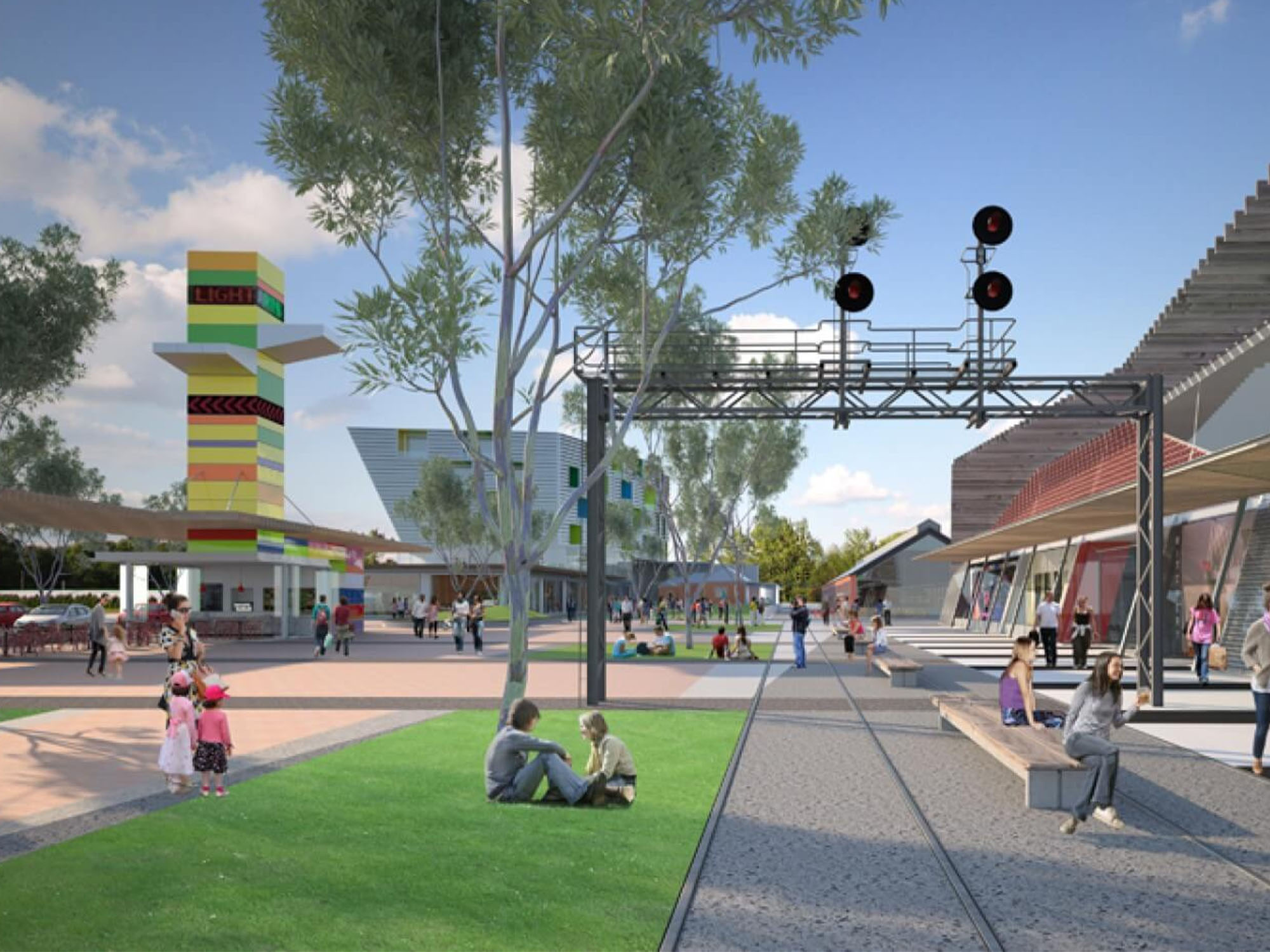
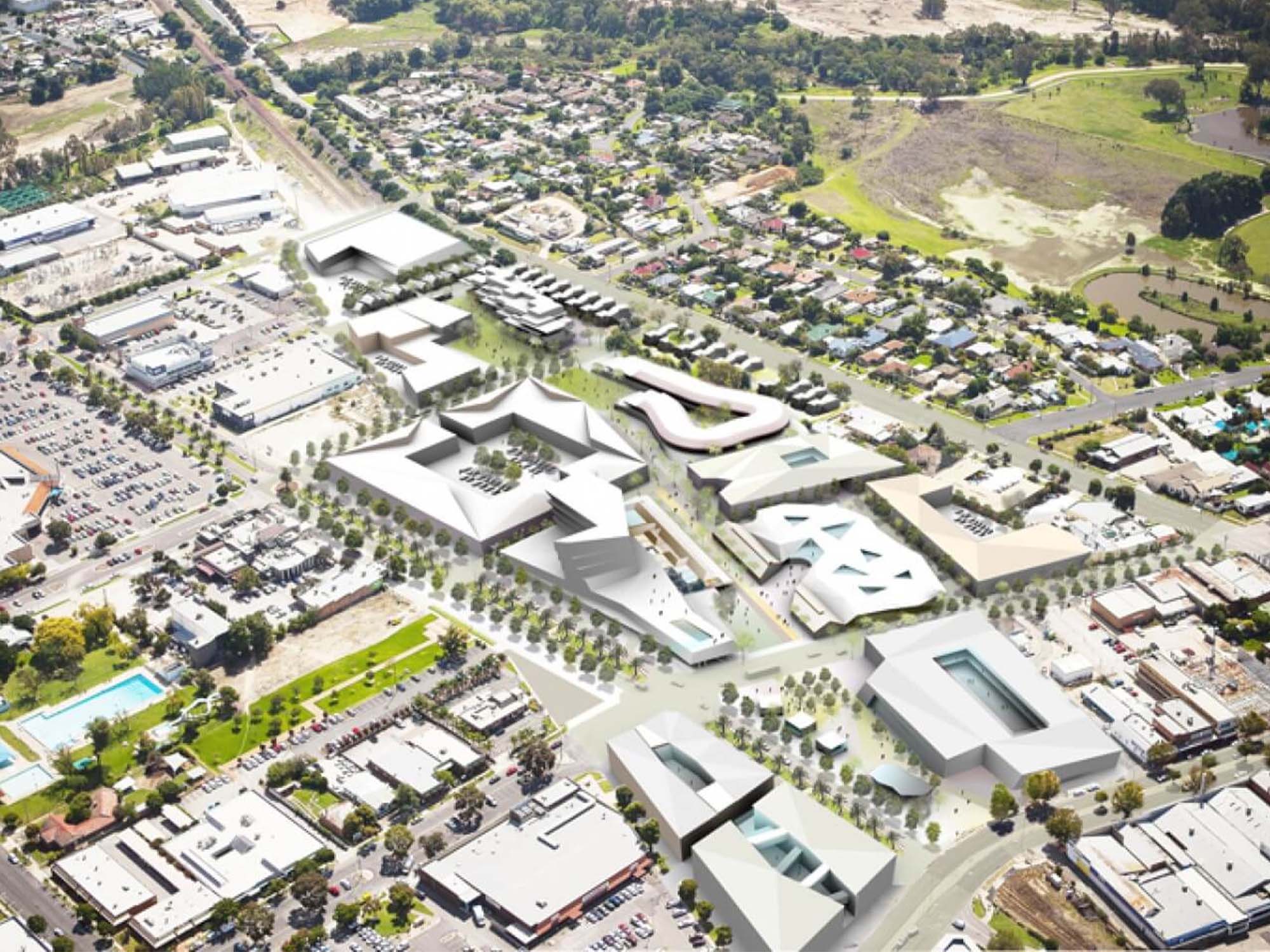
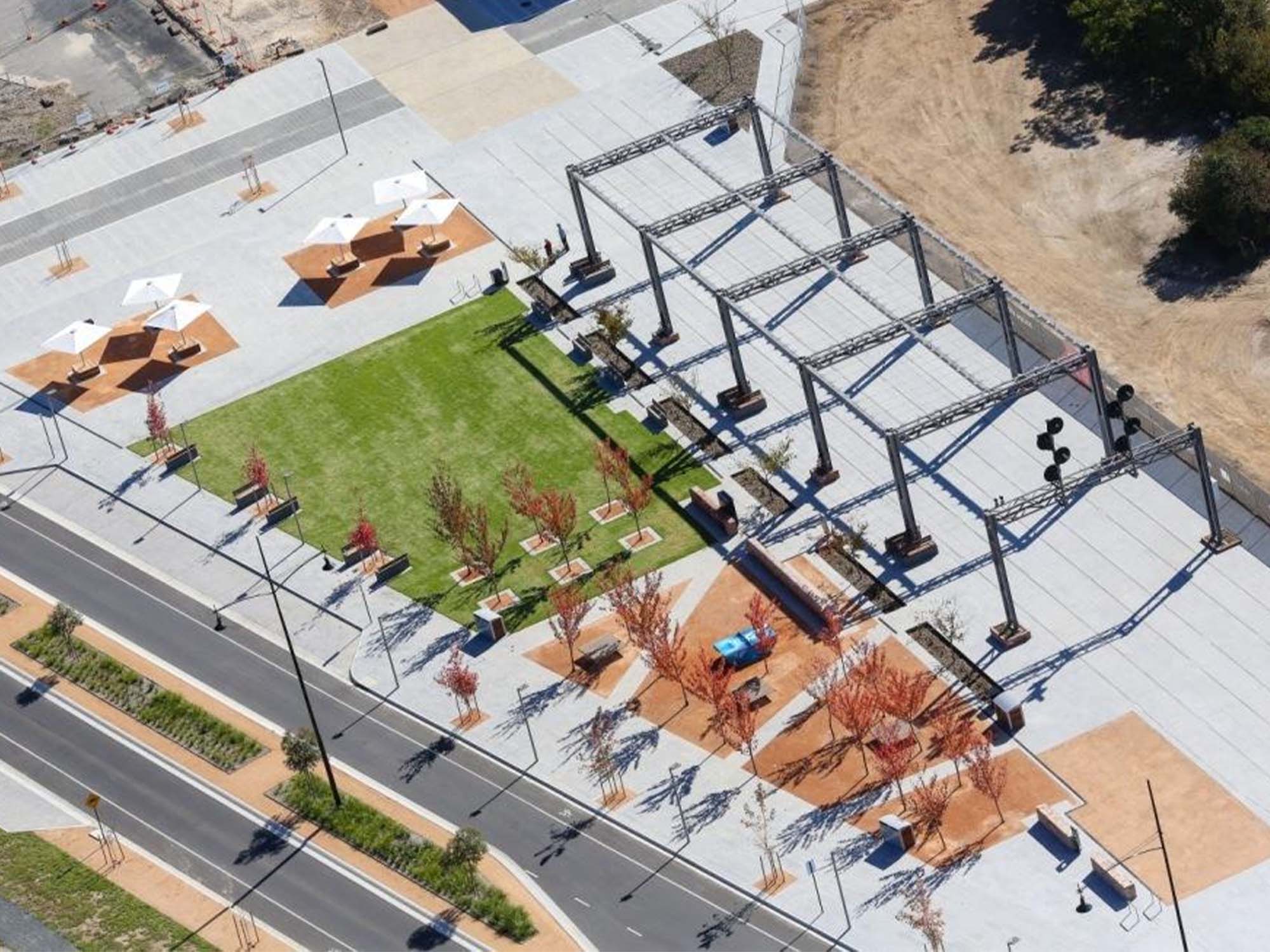

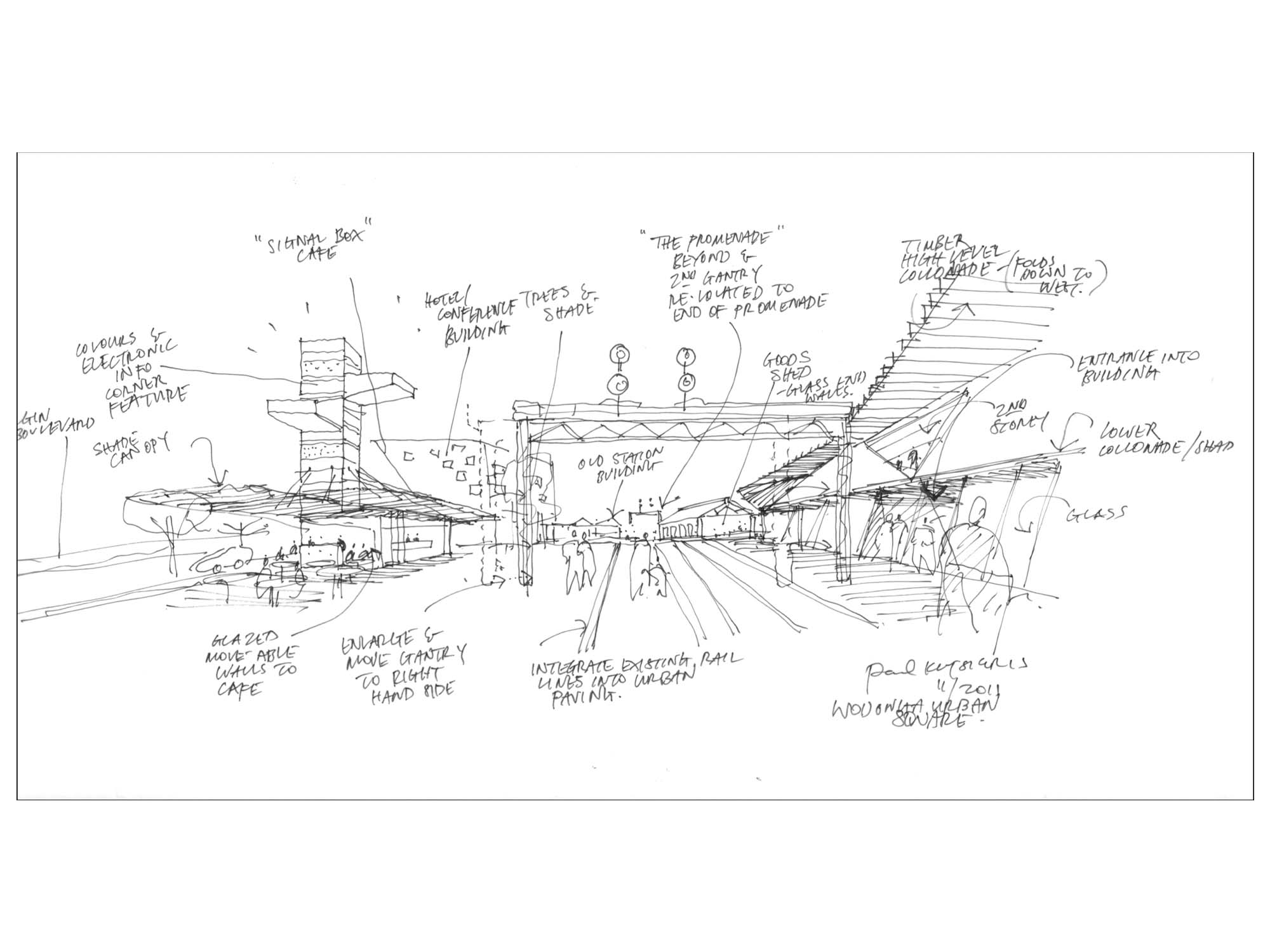


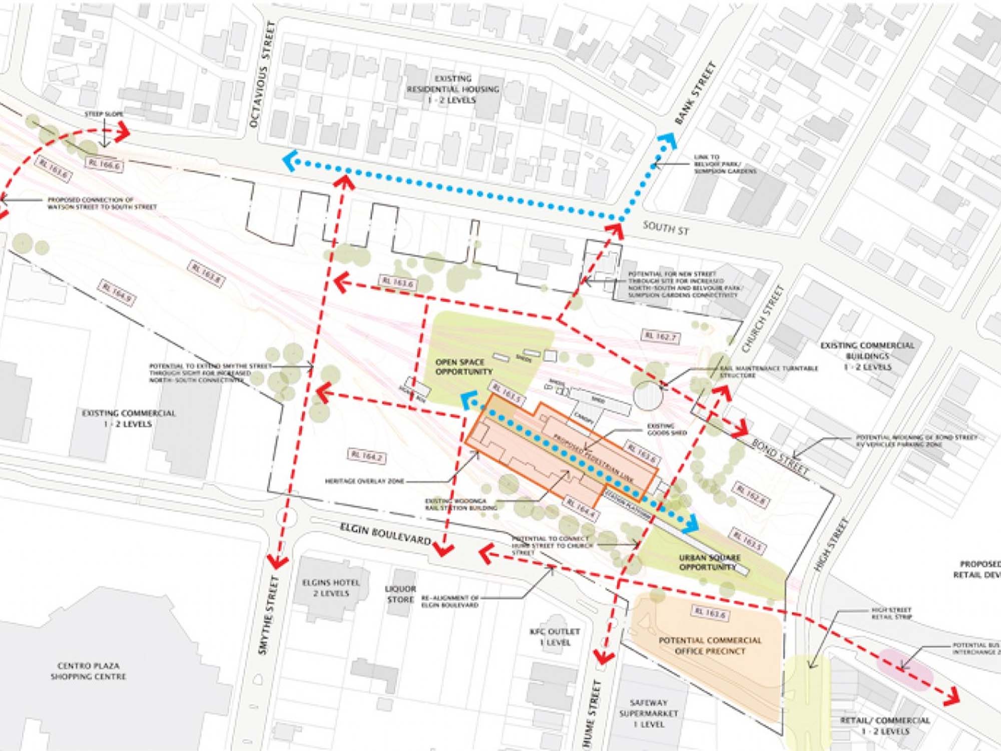
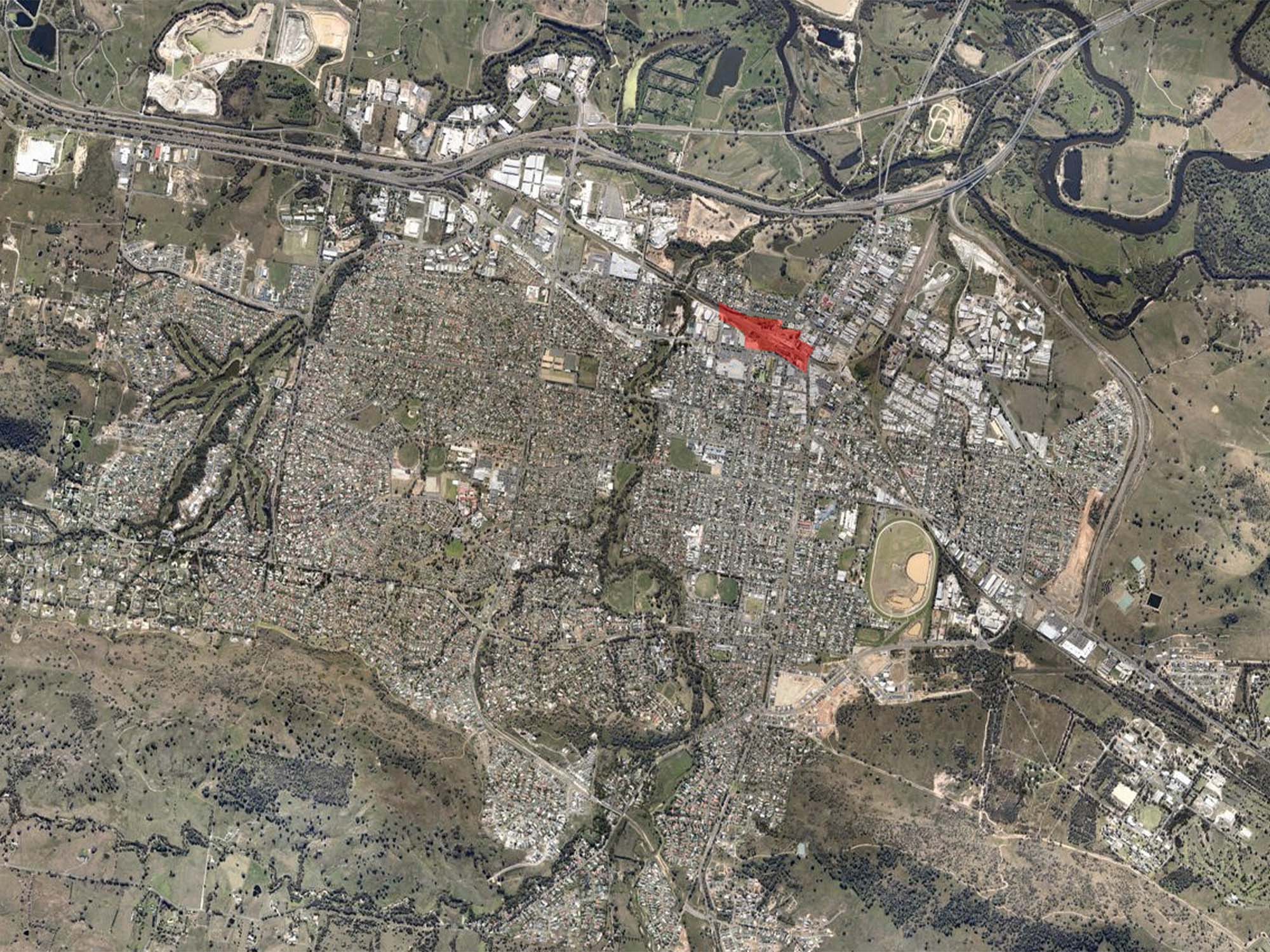
Junction Place, Wodonga is one of Australia's largest urban redevelopment projects; it was also Katsieris Origami's first major urban design.
The city of Wodonga remains Victoria's fastest growing regional city. As well as planning for its expected future growth, we recognised a unique opportunity for this urban design to act as an agent of wider civic and cultural regeneration.
The site of 108,000 m2 (10.8 Hectares) was a 'brownfield' site; the decommissioned original Wodonga Rail Station and rail maintenance yards located in the centre of the city.
Our urban design proposed a network of new streets, roads and public spaces linking existing urban fabric with newly created development parcels. Five new precincts, each with their distinct character, were created within the urban design.
We incorporated a major new pedestrian promenade along the former rail alignment and this linear public space connected a proposed new public square with the buildings of the former heritage rail precinct. Though we met opposition to this core idea, we successfully advocated for the retention of the rail buildings and wove them into the urban design as signature place-making elements. The iconic red-brick, Victorian-era structures subsequently became the first built transformations within the redevelopment and were renovated into much loved, vibrant hospitality venues with retained rail-industrial character.
We also sought to ensure that increased pedestrian movements passed a full range of commercial, retail and civic uses. To further support our aim of ensuring retail shops were visually prominent, the scale of new streets, roads and public spaces were designed to slow vehicles down as they passed through the development.
Future development parcels were also analysed to confirm their flexibility and adaptability for different commercial yields and uses.
Construction of our Master Plan commenced in 2012 with the strategic re-alignment and widening of Elgin Boulevard followed by the new streets and roads. The construction of the new Junction Place public square and the new public promenade followed. The project continues to be built out according to our urban design and Master Plan.
Its been fascinating to follow the urban changes over time and see first-hand how citizens and visitors have responded to this ever-evolving piece of Wodonga.
Traditional and Continuing LandCountry of the Wiradjuri, Waveroo & Dhudhuroa people
Client
Development Victoria,
VicTrack
Area
108 800 m2 (10,8 Hectares)
Status
Ongoing
Genre
Urban Design / Master Plan
Theme
Urban Regeneration / Brownfield Site / Heritage
Project Team
Katsieris Orgiami (Urban Design/Master Plan)
Aspect Studio (Landscape Design)
Awards
Victorian Premier’s Design Awards;
Commendation (2016)
Australian National Urban Design Awards; (2017)
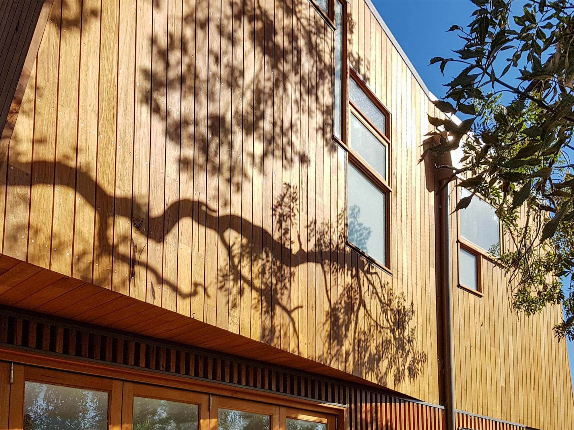

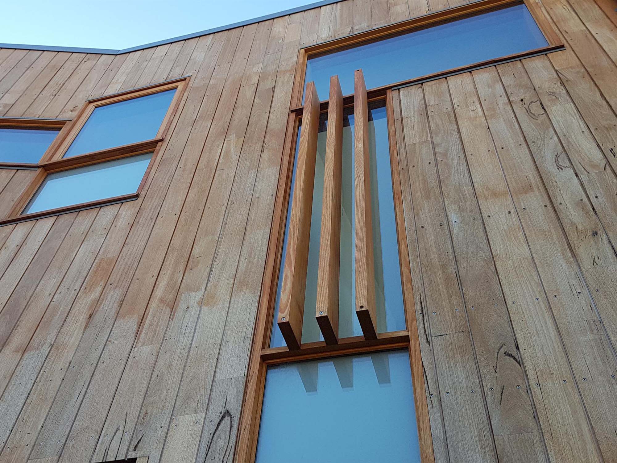


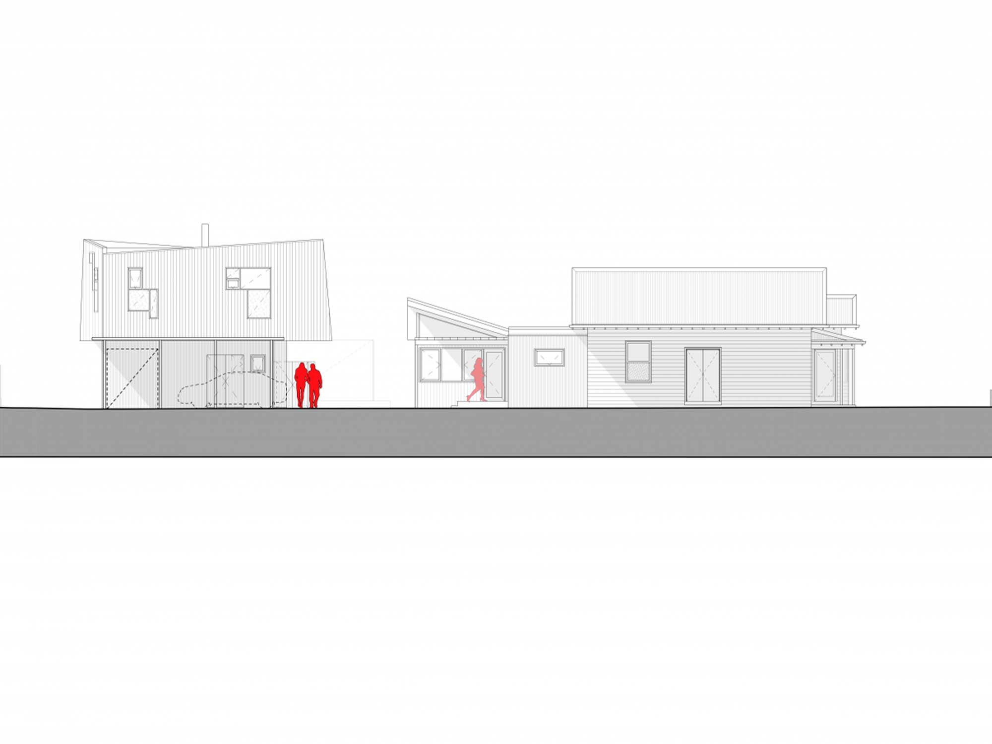


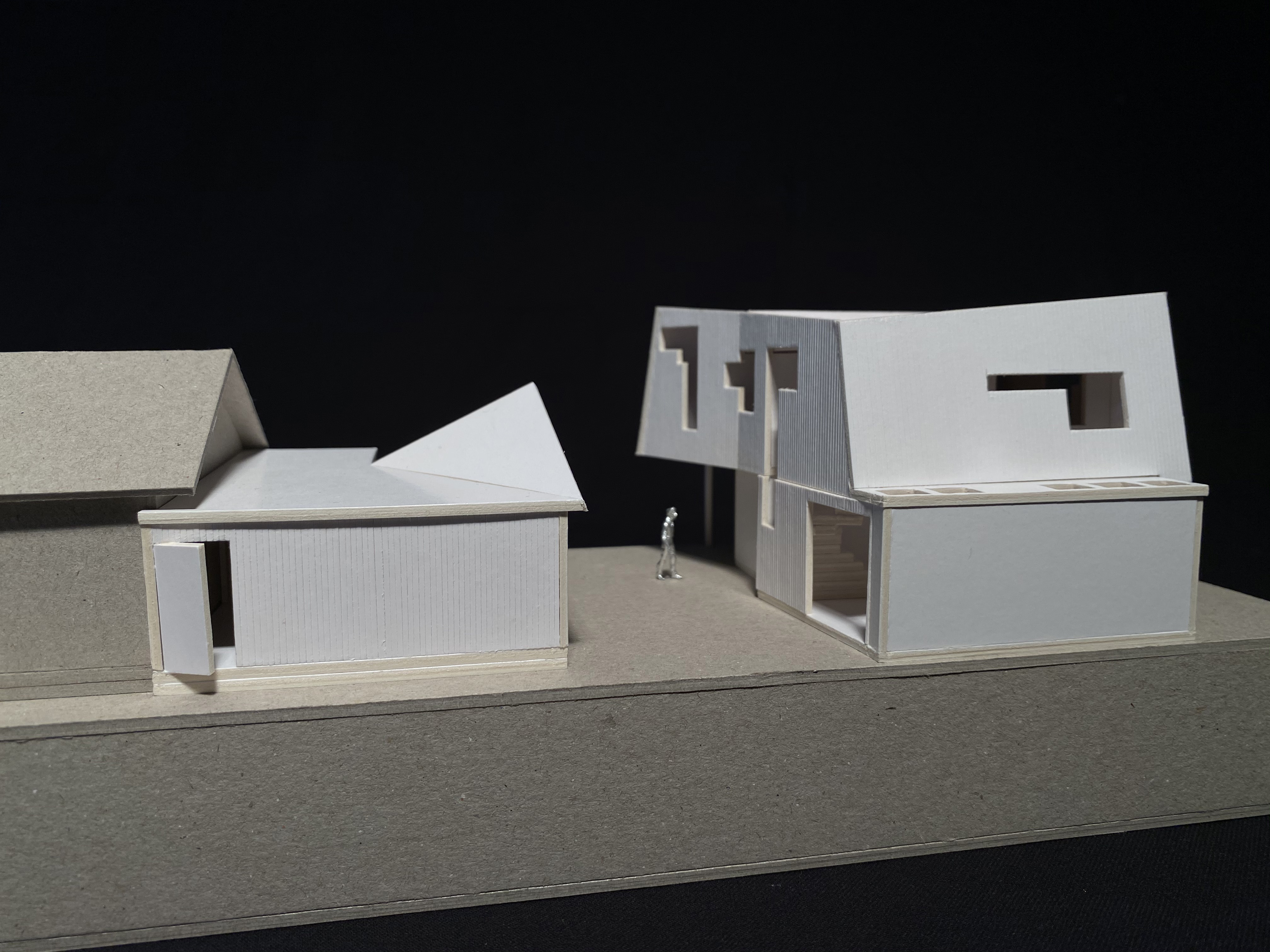


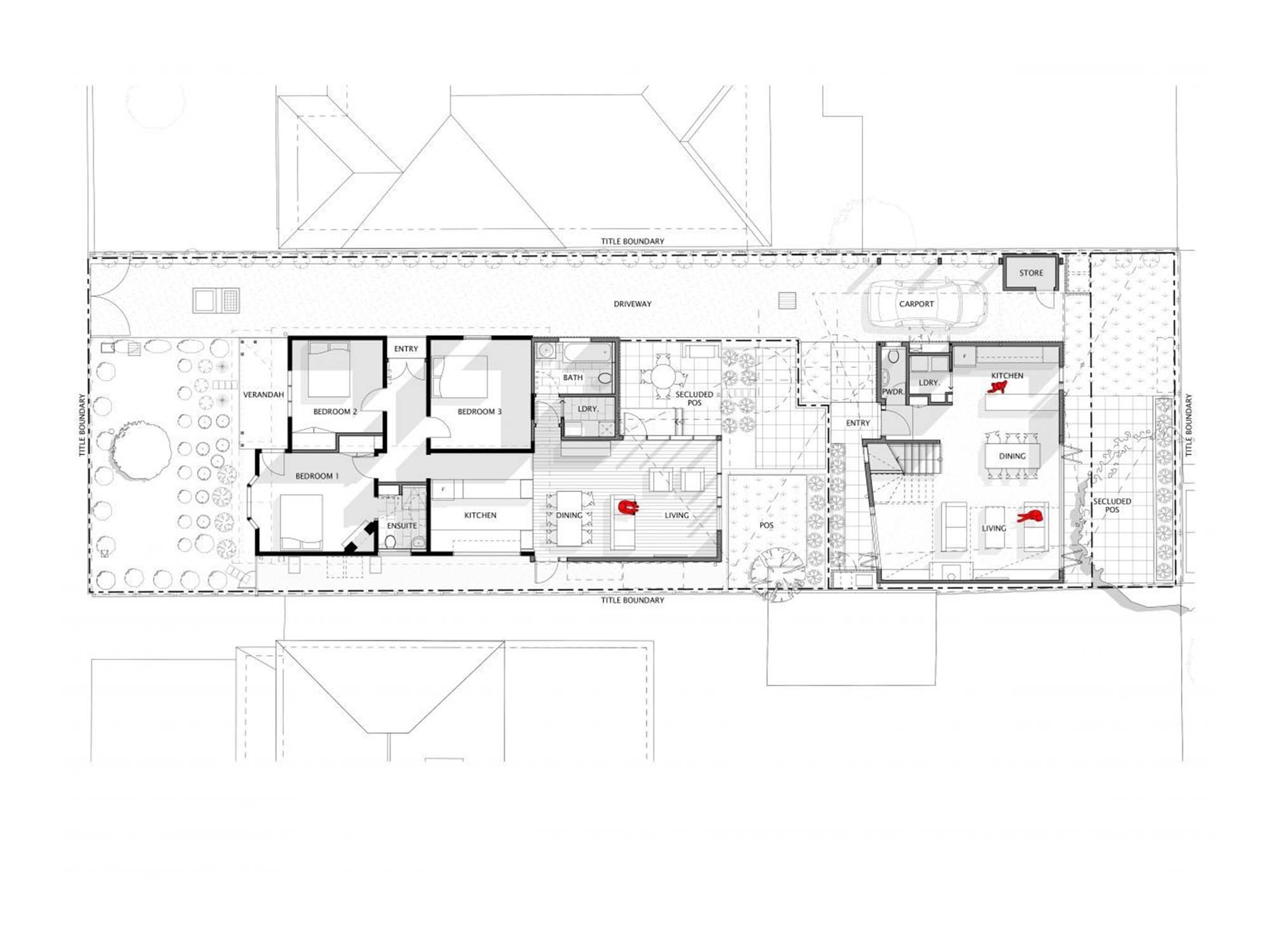


Located in the inner-city Melbourne suburb of Yarraville, this modest, two-dwellings-on-a-lot development negotiates the complexities of a small site containing an existing heritage worker’s cottage. Our clients were a multi-genrational family seeking to live in their own houses but on the same site. Their brief to us was to completely refurbish and extend the existing cottage and construct a new, separate townhouse in the backyard.
The small backyard, combined with restrictive overlooking regulations, drove our design response. The motif of house-as-periscope was developed as an analogy; light and views would be captured up high and reflected down via mirror to the levels of habitation without impacting on the privacy of neighbouring residences.
The cantilevered, ‘pinched-waist’ form of the new dwelling ensured it was tuned to maximise potential view, sun, and ventilation opportunities. Though compact, the 480 m2 site offered the potential for enticing city views and the periscope-like window treatments, wall-voids and reversed, ‘top-heavy’ massing allowed us to capture these.
A resultant calmness permeates the interior as the periscope windows promote the admission of diffuse, soft, white filtered light.
Bento space / slippage space
On such a compact site it was important to ensure the bento-like interior spaces felt larger and more spacious than their physical reality. Narrow, double-height voids created through the ‘slippage’ of upper and lower level geometries were designed to add a dimension of vertical flow through the main volume. Angled walls were introduced to further the sense of space extending out / or up / or around; space released beyond the confines of its physical boundaries.
Both dwellings are further spatially enlivened by a richly planted, pocket courtyard-garden established between them.
Battery / Solar
This project was also our first residential development to incorporate household lithium battery power storage in the designs.
6.4 kW/h household batteries are energised by 5.0 kW solar photovoltaic cell arrays installed on the roofs of both dwellings.
As well as achieving an annual reduction in carbon emissions of around 7,100 Kg/Co2 per dwelling, our clients report that since occupation, electric power bills for both dwellings have been minimal to non-existant.
Traditional and Continuing Land
Country of the Wurunjuri Woi Wurrung & Bunurong people
Client
Private
Area
140 m2 New house / 135 m2 Existing house
Levels
2 (New house) / 1 (Existing house)
Status
Complete (Images shown here taken during construction)
Genre
Meta-Modern
Themes
Cantilevered Volumes / Prismatic Interplay

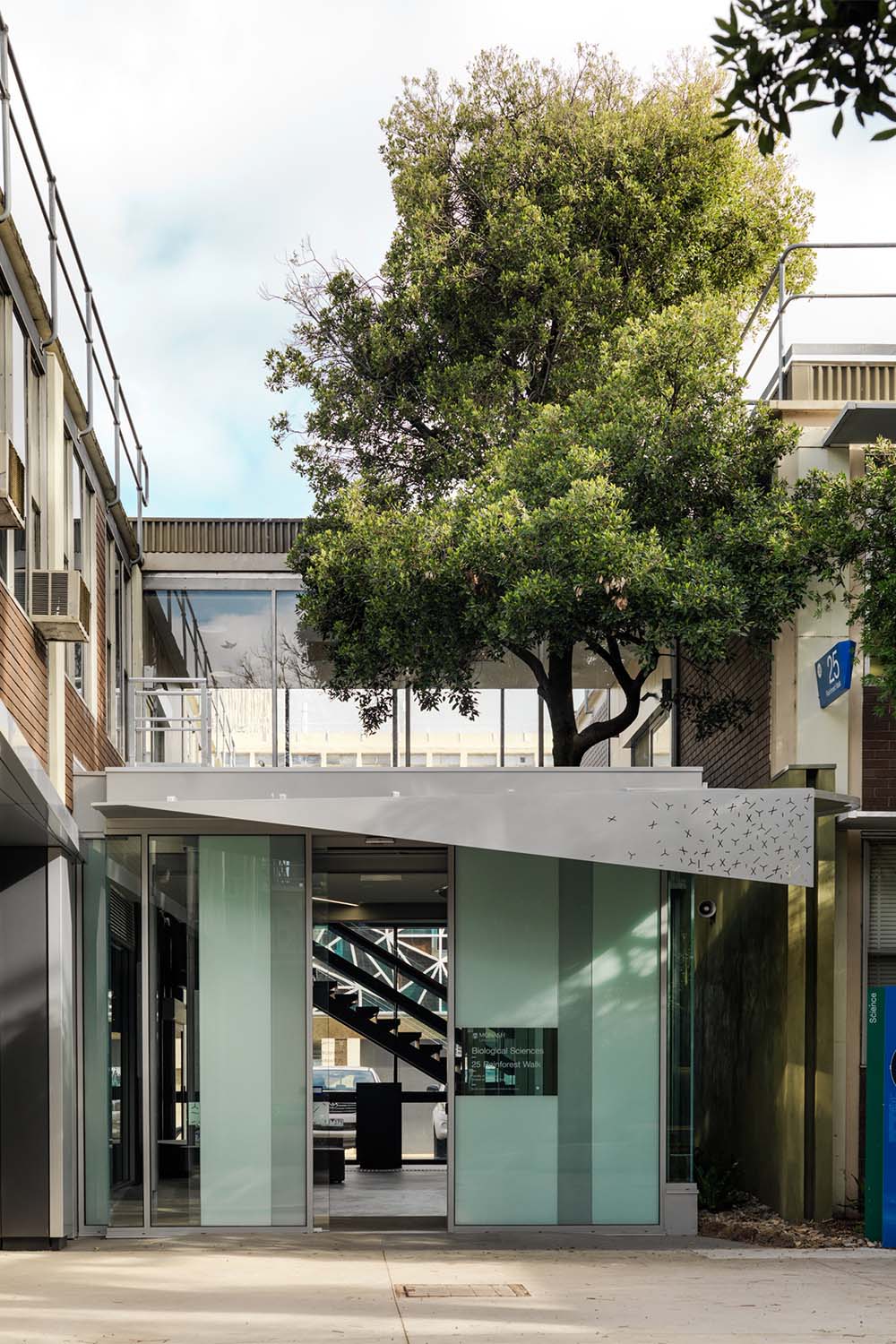

This project aimed to design a series of limited, low cost but high-value strategic interventions to an existing, 1970’s era functionally driven School of Biological Sciences building at Monash University’s Clayton campus.
There were three primary interventions: a new entrance and foyer to the building, a new student space in a disused undercroft, and a new garden deck to the rear of the building near a loading dock. Our brief: use design to convert a series of unfriendly existing spaces into welcomming, useable spaces.
Cinderella Space
From the outset, we were working with piecemeal offcuts of secondary, low utility space clinging to the periphery of an existing, unrelentingly linear building. Yet this linearity became a useful datum for our more shaped interventions placed around it. We began to see the latent value in the three off-cuts of poor space we had to work with; we began to conceive of the fragmented, poor-quality space as Cinderella space.
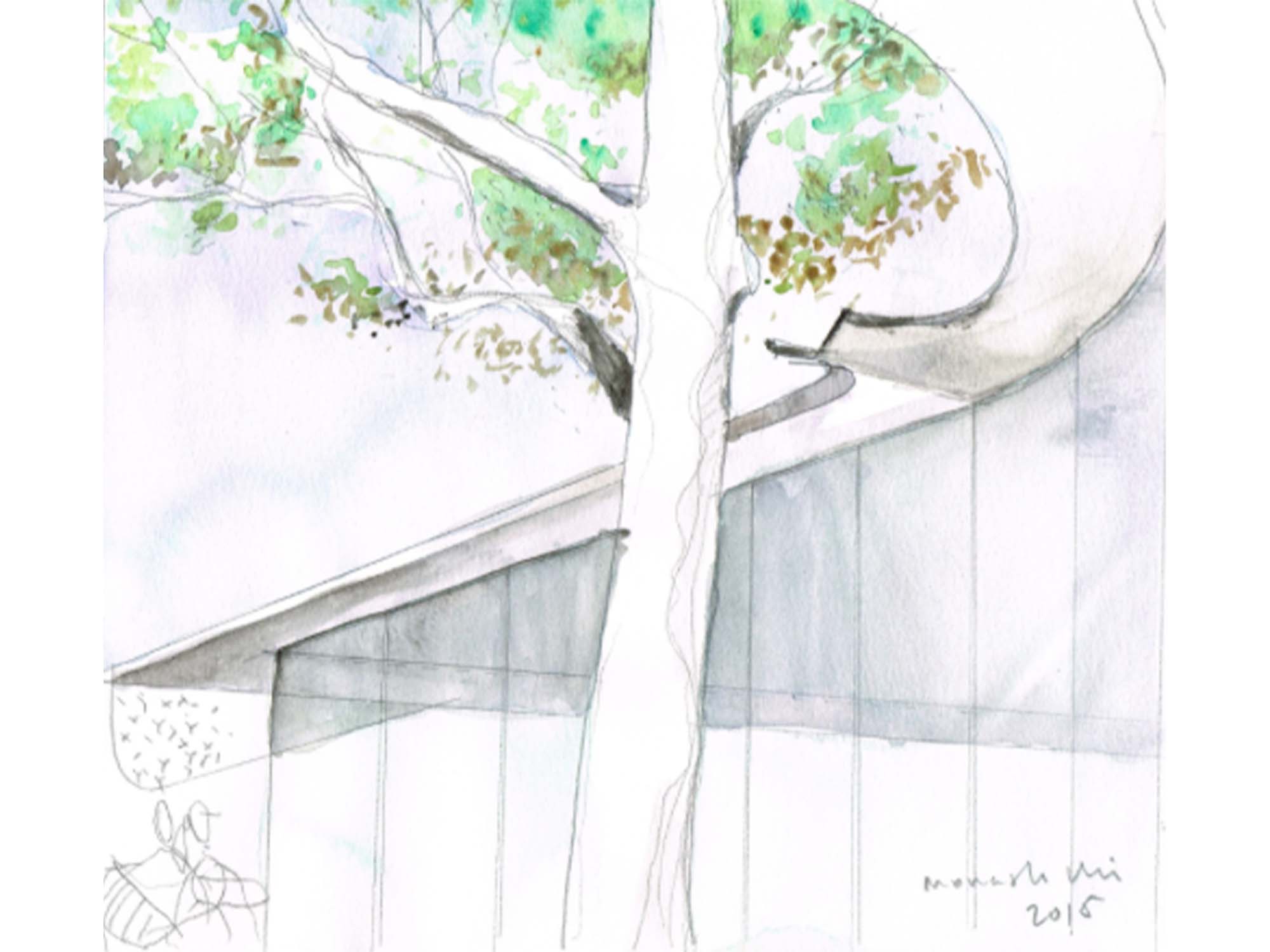
Entrance Foyer / Tree - A small tree in the vicinity of the new entrance was proposed to be removed to make way for the new entrance however the university accepted our proposal to retain the tree and form a new entry around it. The new entry therefore became one informed by a design proposition; the foyer walls would embrace and protect the tree and the roof would nuture it. The roof is designed to gather rainwater onto a spillway gutter which directs water onto the tree through a strategically positioned spout.
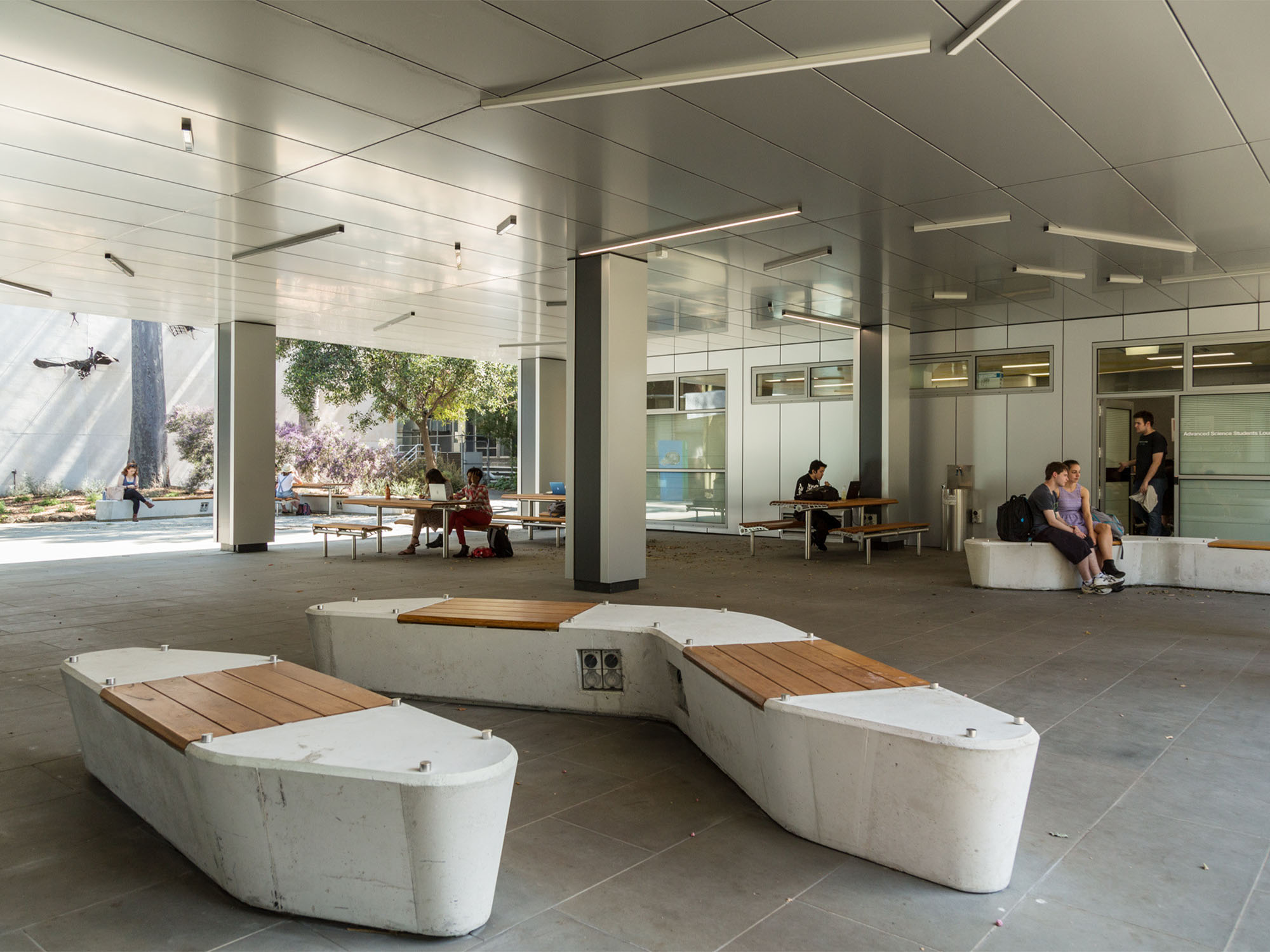
Undercroft / Meeting Room - An underutilised building undercroft, dark and cluttered, was transformed into a sheltered student space with tables and seating, BBQs, powered workspaces, and bicycle parking. The existing walls and soffit were clad in new skins of metal panels designed to reflect more light into the space. What was formerly a tunnel of poor quality space was transformed into a well-utilised student meeting and recreational area.
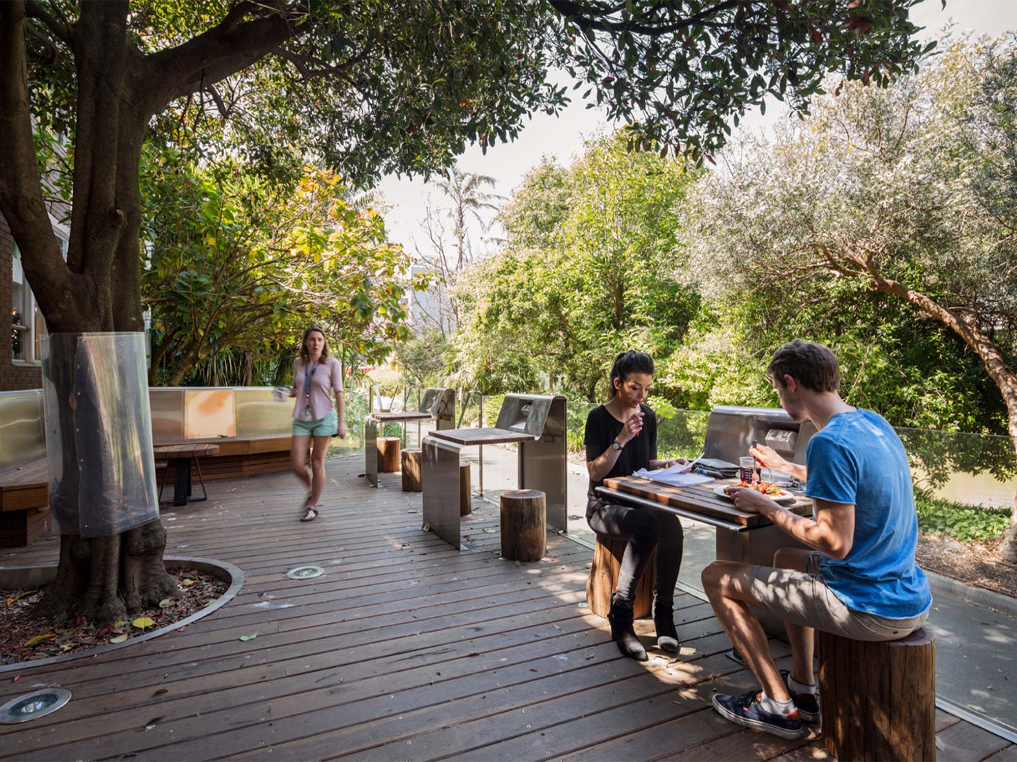
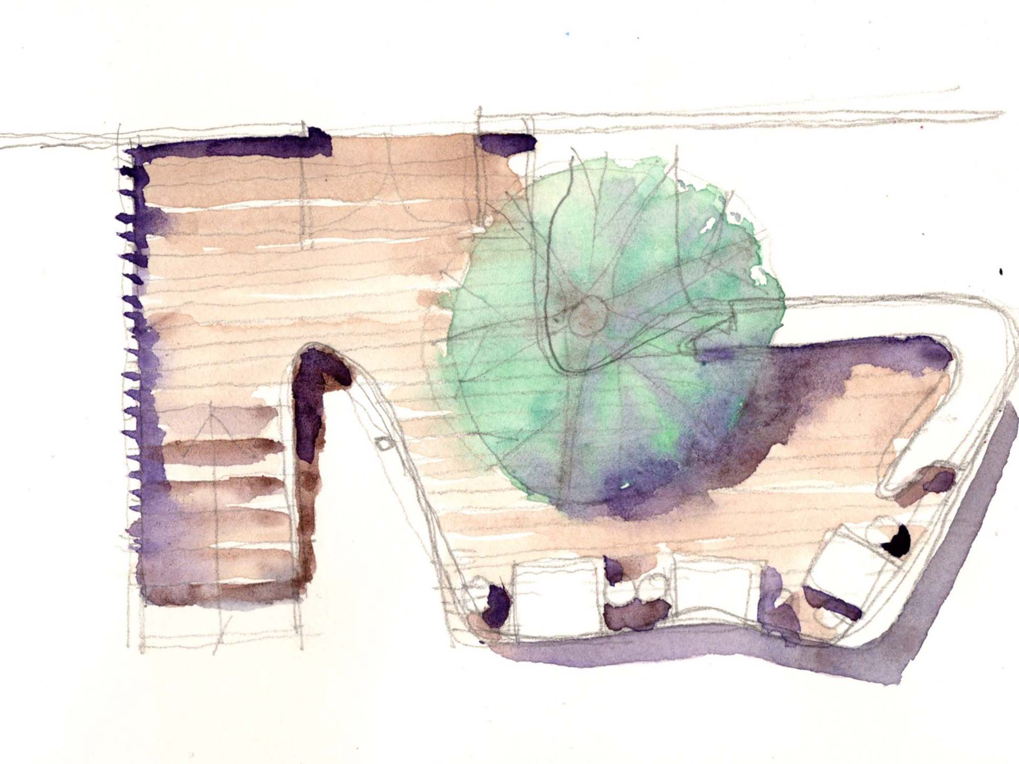
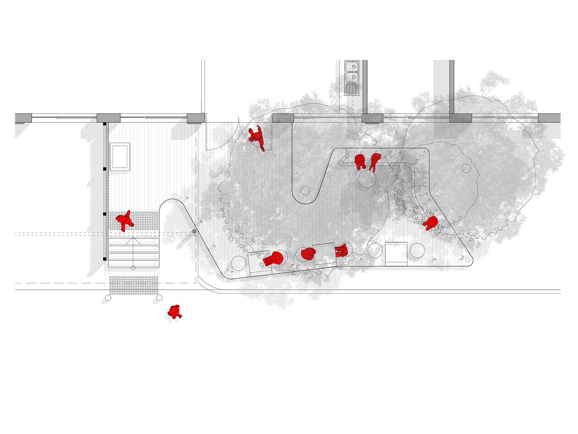
Timber / Stainless Steel - A new timber deck at the rear of the building was floated over existing tree root zones with minimal impact. Shaped to weave around an existing tree, the deck also incorporated outdoor work-tables and seating allowing staff and students to recharge devices, work and meet within a garden setting. The design of the timber deck structure incorporated a play between two materials not often paired together; hardwood timber and polished stainless steel. The design of the deck became a game of opposing material interplay, - one between the timber of the deck and the stainless steel plate forming the continuous, ribbon-like looping balustrades, seating tables and fascia that define the deck’s perimeter.
Traditional and Continuing Land
Country of the Wurundjeri Woi Wurrung & Bunerong people
Client
Monash University
Area
550 m2
Levels
2
Status
Complete
Genre
Strategic Interventions
Theme
Site-specific design manouvres